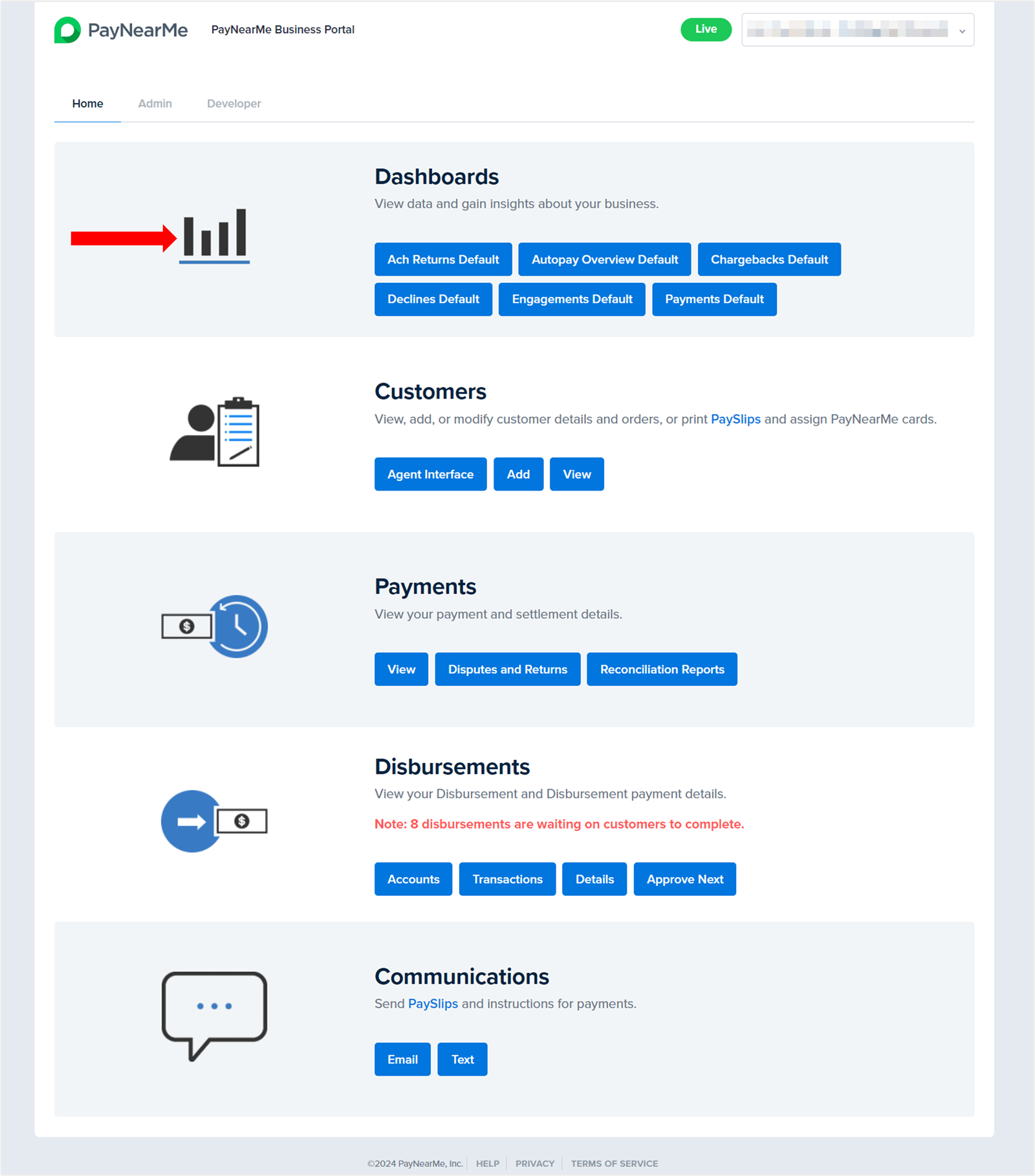
Insights Dashboards
PayNearMe’s Data+ Insights provides an enhanced reporting solution via customizable dashboards. These dashboards enable you to assess your payment and consumer data in real-time through easily digestible charts—instead of digging through dozens of hard-to-read reports. With just a few clicks, you can filter and customize your data to gain better insight into the following:
- Payment Types
- Payment Channels
- Payment Distribution
- Declines and Returns
- Chargebacks
- Autopay Counts
- Engagements
Accessing the Dashboards
Your PayNearMe Technical Account Manager (TAM) will activate your dashboards for your Business Portal. To access them, simply log into the portal and, if not already selected, click on the Home tab. The dashboards will display under the Dashboards section.
Customizing the Dashboards
Each dashboard provides multiple charts that can be customized with specific variables to meet your unique business needs. With just a few clicks, you can quickly drill down on a specific variable/issue or view the overall performance of your payment solution with real-time data that instantly populates.
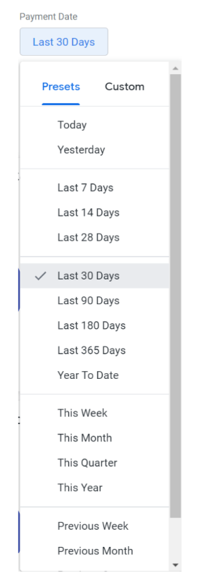
The Date Filter
Use the Payment Date filter to choose from 18 different predefined date ranges. These ranges can go up to a year prior.
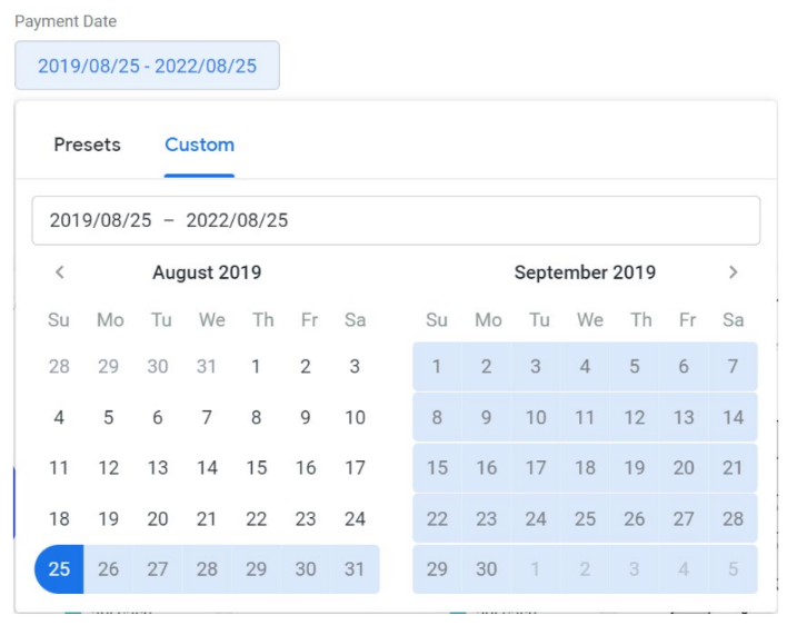
If you need more than a years’ worth of data or a more specific date range that’s not covered by the predefined selections, use the Custom tab to select your own date ranges. You can enter a specific range in the text box by formatting the dates in yyyy/mm/dd format or select your dates from the date picker below the text box.
From there, the charts and graphs for that dashboard will populate with real-time payment data.
The Variable Selectors
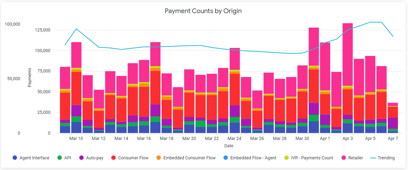
Nearly every chart that displays on the dashboards contain variables. These variables can range from payment types and origins, decline/return reasons, chargeback types and origins, autopay types, and engagement types. To add or remove a variable from a chart, simply click the colored dot that displays next to the variable’s name in the chart key. Below is a chart displaying daily transaction declines by origin.
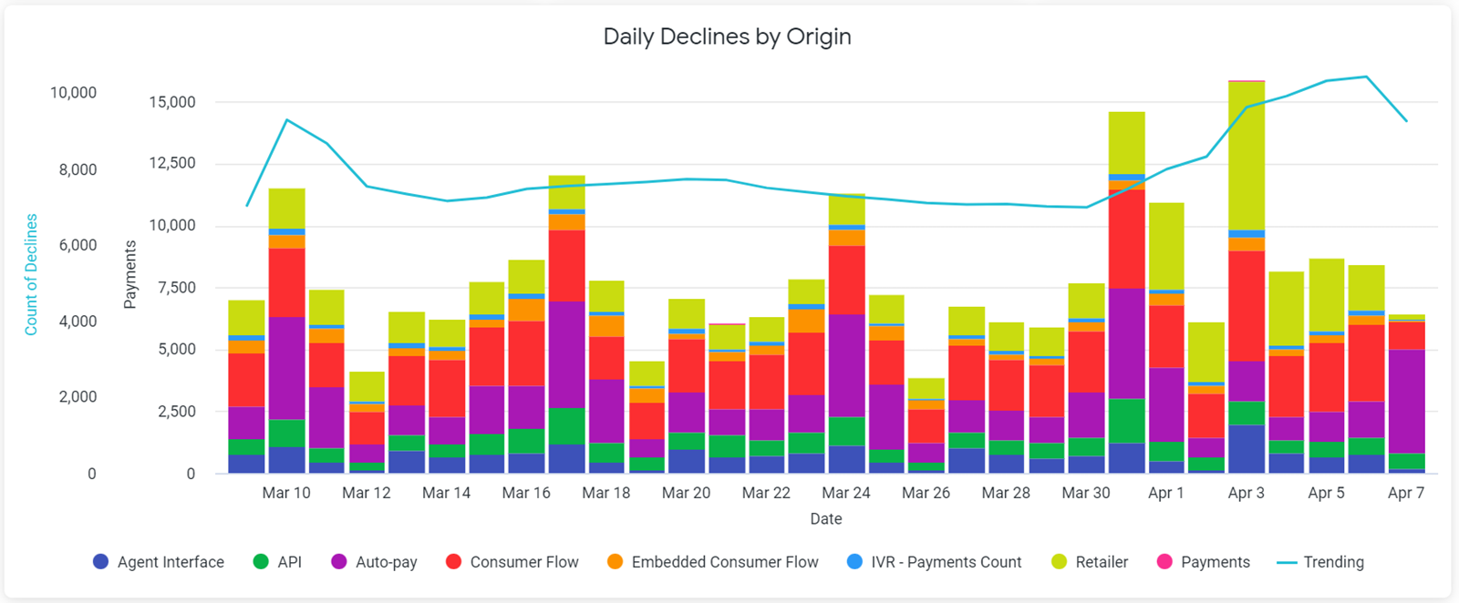
Each origin variable (i.e., or PayNearMe product) is represented by a corresponding color in the chart key. Let’s say you only want to see transaction declines that occurred via autopay and the consumer portal. You would click on every variable besides Auto-pay and Consumer Flow to remove them from the chart. The dashboard automatically reloads and displays the following:
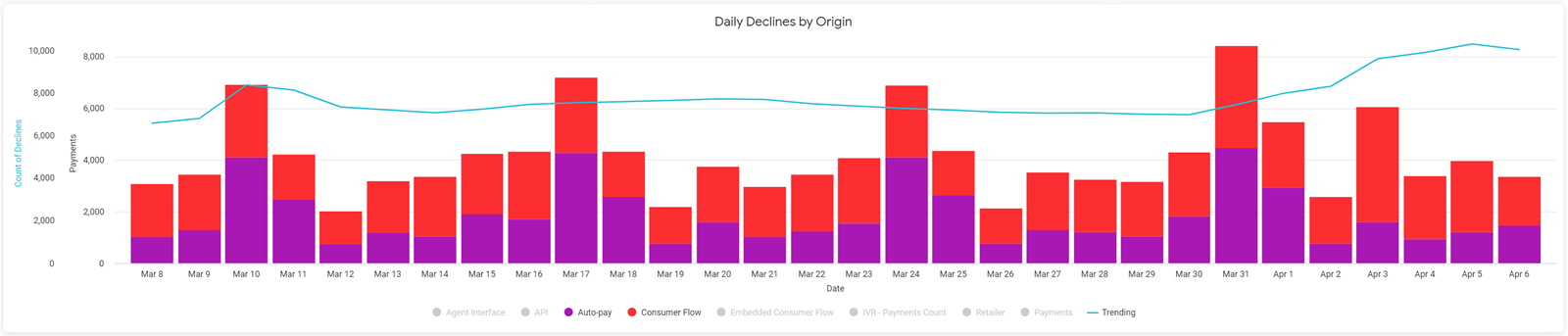
To re-add the other variables, simply click on them again and the dashboard reloads the chart.
Trending Lines
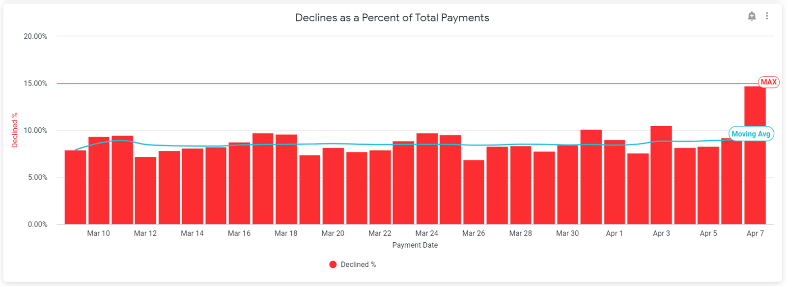
As you can see above, some charts contain trending lines. Trending lines show the moving average for all variables at that point in the specified timeframe. To remove the line, simply click the Trending variable in the chart key. Other charts with percentages or ratios may also show a Max or warning line that indicates the maximum number of variables allowed by PayNearMe’s compliance and risk rules. For example, the following chart shows the decline percentage for each day in the specified timeframe.

As displayed in the chart, PayNearMe only allows a certain number of declines per day, which is 15% of the total number of payment transactions. These warning lines cannot be removed.
Using the Payments Dashboards
Use the Payments Dashboards to access and evaluate real-time payment data and make business decisioning more efficient.
Payment Counts and Sums by Type
Use these tables to evaluate the payment methods that consumers are using to make payments. The Payment Counts by Type table displays the total number of payments made with each payment type, while the Payment Sums by Type table displays the sum total of payments for each payment type.
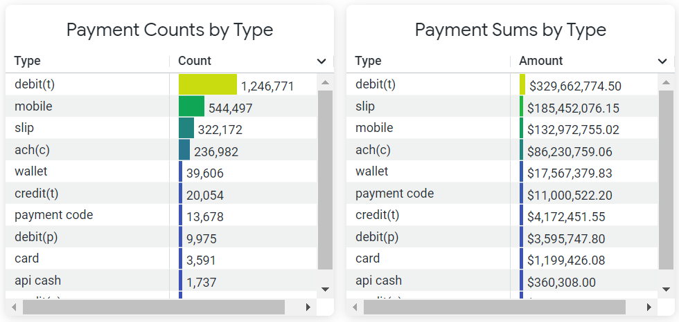
The following payment types are represented:
Payment Types DisplayedYour merchant configuration might only support certain payment types (e.g., cash only).
| Payment Type | Description |
|---|---|
| ach | Bank Account |
| api cash | Cash using an API-generated payment slip |
| card | PayNearMe card (no longer supported) |
| credit | Credit Card |
| debit | Debit Card |
| mobile | Cash using a barcode in the Consumer Portal |
| payment code | Cash using a QR code |
| slip | Cash using a printed payment slip |
| wallet | Mobile Wallet, such as
|
The Payment Counts by Type table is also represented in a bar graph with the same name. To see the precise number of payments that were made with a payment type on a specific date, hover over its corresponding bar in the chart.
Payment Counts and Sums by Origin
Use these tables to evaluate how consumers are making payments on the PayNearMe platform. The Payment Counts by Origin table displays the total number of payments made for each PayNearMe product, while the Payment Sums by Origin table displays the sum total of payments for each PayNearMe product.
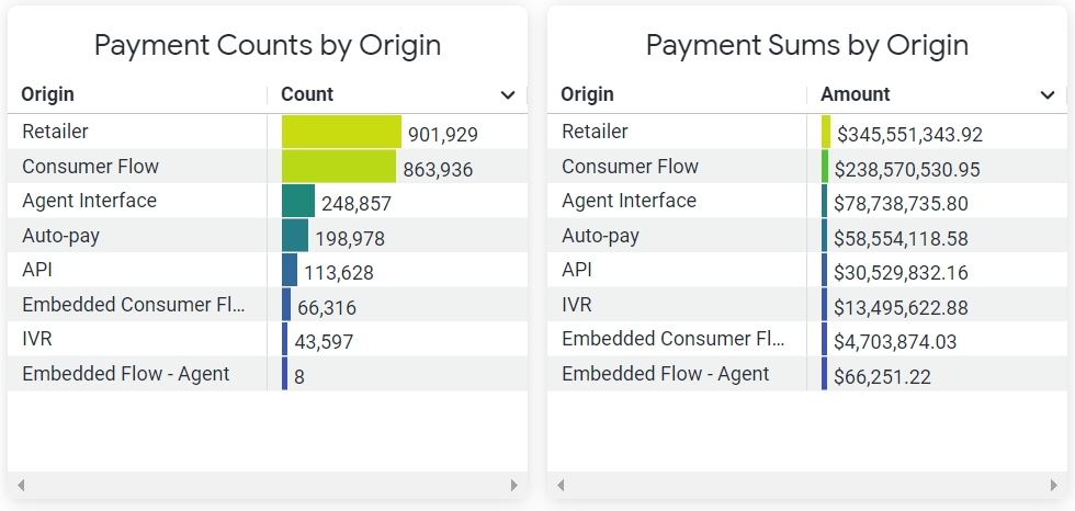
The following PayNearMe products are represented:
Displayed ProductsThe products that display on your dashboards will depend on how you are integrated with the PayNearMe platform.
| Payment Origin | Description |
|---|---|
| API | API Integration |
| Auto-pay | Autopay Schedules |
| Consumer Flow | Consumer Portal |
| Embedded Flow - Agent | Agent via Embedded Form |
| Embedded Consumer Flow | Embedded Client |
| IVR | IVR Integration |
| Agent Interface | Agent Interface (Business Portal) |
| Retailer | Retailer |
The Payment Counts by Origin table is also represented in a bar graph with the same name. To see the precise number of payments that were made via that PayNearMe product on a specific date, hover over its corresponding bar in the chart.
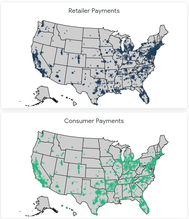
Retailer and Consumer Payment Counts
The Retailer Payment Counts and Consumer Payment Counts graph displays the geographic locations where consumers are making cash payments (i.e., Retailer Payment Counts) and electronic payments (i.e., Consumer Payment Counts). To see the total number of payments made within that zip code, hover over the corresponding dot on the map.
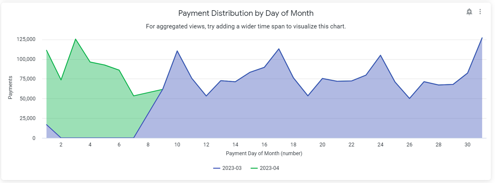
Payment Distribution Charts
The payment distribution charts let you drill down into your payment data to see precisely when consumers make payments.
Day of Month
The Payment Distribution by Day of Month chart shows the day of the month when consumers are most likely to make a payment. Use it to identify payment patterns and adjust your order presentment schedule to maximize payment acceptance. For best results, set the Payment Date filter to the Last 30 Days or more.
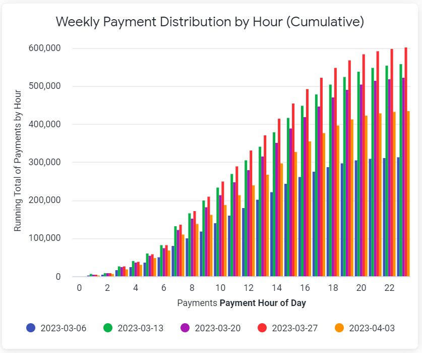
Weekly
The Weekly Payments Distribution by Hour chart displays the cumulative number of payments made each hour for the specified week. For best results, set the Payment Date filter to any value under 30 days.
Hourly
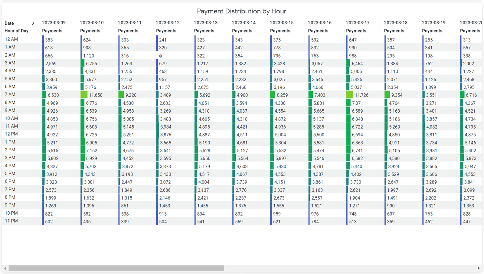
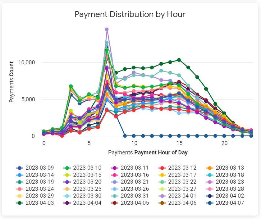
The Payments Distribution by Hour chart displays the exact number of payments made each hour of the day. For best results, set the Payment Date filter to a value that is no more than 7 days. Ideally, these charts should display data for 1-2 days.
Using the Risk Dashboards
The Risk Dashboards offer comprehensive summaries of risk model components, including risk types, frequency patterns, threshold amounts, and scoring methodologies, which inform payment decisions and recommendations.
Transaction Recommendations
The Transaction Recommendations dashboard provides a comprehensive view of the distribution and frequency of automated risk-based decisions—Approved, Review, and Declined—across your payment activity. This tool enables effective monitoring of the risk model's impact on transaction outcomes. Quickly assess overall performance with summary tiles that display the count and percentage of each recommendation type:
- Approved
- Review
- Declined
These high-level metrics offer an at-a-glance understanding of how your transactions are being evaluated by the risk engine.
Recommendation Count (Time-Series Chart)
This line chart tracks the daily volume of each recommendation category over time. It helps you:
- Identify fluctuations in transaction volumes,
- Detect trends that may indicate shifts in risk model behavior, and
- Pinpoint spikes or anomalies in specific categories.
Hover over any data point to view the exact daily count per recommendation status.
Recommendation Percentage (Trend Analysis)
This visualization shows the proportional distribution of recommendation outcomes as a percentage of total transactions over time. It is especially useful for:
- Evaluating risk engine sensitivity,
- Monitoring approval and decline rate stability, and
- Detecting gradual shifts in risk scoring logic.
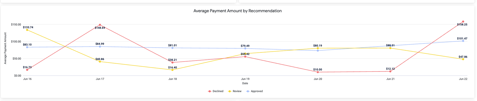
Average Payment Amount by Recommendation
Use this dashboard to analyze the average payment size associated with each recommended payment outcome (i.e., Approved, Review, and Declined). This view supports the identification of potential correlations between transaction amounts and risk classifications:
- Approved transactions typically maintain consistent average values which reflects standard payment behavior.
- Review and Declined outcomes may exhibit spikes or volatility, which can signal outliers or potentially suspicious activity.
Hover over any data point to view the precise average payment amount for a specific date and recommendation category.
Decline Recommendation Insights
These charts provide a detailed breakdown of declined transactions by payment category, highlighting both the frequency and average dollar amounts of declines alongside their associated average risk scores, to help identify high-risk and high-exposure payment methods.
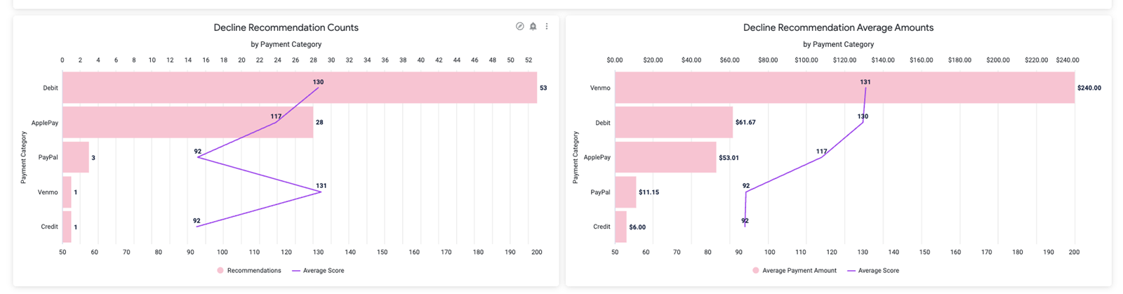
Decline Recommendation Counts by Payment Category
This horizontal bar chart breaks down decline recommendations by payment type (e.g., Debit, ApplePay, Credit). A superimposed line tracks the average risk score associated with each type, enabling deeper analysis of high-risk categories.
Decline Recommendation Average Amounts by Payment Category
This chart reveals the average dollar value of declined transactions per payment type, again paired with average risk scores. Use this to understand which payment methods not only trigger declines but also represent higher financial exposure.
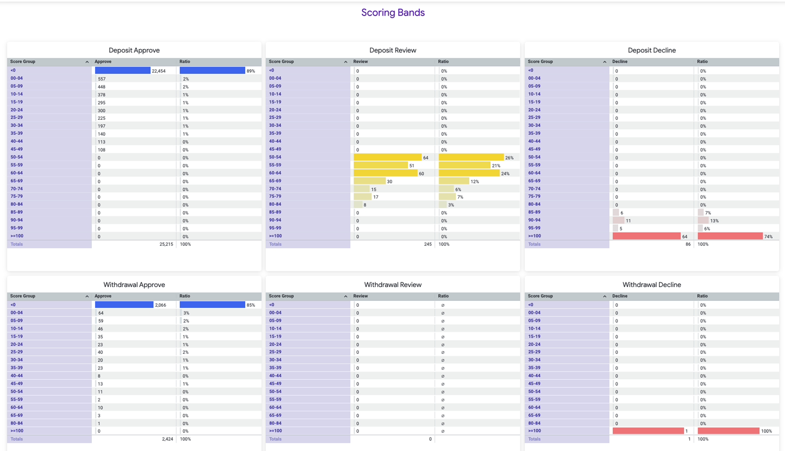
Scoring Bands
The Scoring Bands tables categorize transactions into defined risk score ranges and display how many were Approved, Reviewed, or Declined within each band. This view helps assess how risk scores correlate with decision outcomes and supports the evaluation of scoring thresholds and calibration accuracy. The table sections include the following:
- Deposit: Approve/Review/Decline: Displays the distribution of deposit transactions across risk score bands.
- Withdrawal: Approve/Review/Decline: Mirrors the deposit section, focusing on the distribution of withdrawal transactions by score range.
Each column includes:
- Score Group – Defined score intervals (e.g., 55–59, 95–99).
- Transaction Count – The number of transactions assigned to each decision category within a score group.
- Ratio – The percentage of total transactions falling into each score band.
This analysis is particularly valuable for validating the effectiveness of score-based decisioning and ensuring the risk model is appropriately calibrated across different transaction types.
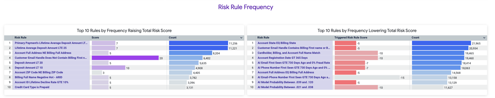
Risk Rule Frequency
This section reveals the most influential rules in the risk scoring model.
Top 10 Rules by Frequency Raising Total Risk Score
This chart highlights the rules that most often contribute to elevated risk scores, providing insight into the behaviors or attributes that trigger risk escalations. For each rule, the following details are displayed:
- Rule name
- Average score added
- Number of transactions affected
Use this view to identify the most common risk triggers and better understand the system’s risk detection priorities.
Top 10 Rules by Frequency Lowering Total Risk Score
This complementary chart focuses on rules that reduce total risk scores, reflecting positive user behaviors or trust-building signals. For each rule, the dashboard shows the following details:
- Rule Name
- Average Score Decrease
- Number of Transactions Affected
This view is especially useful for analyzing the factors associated with lower-risk profiles and understanding how the system rewards trustworthy behavior.
Using the Declines Dashboards
Use the Declines Dashboards to ascertain when, where, and why payments are declining.
Declines by Origin
Use the Declines by Origin charts to view how many transaction declines occurred for each PayNearMe product.

The following PayNearMe products are represented:
Displayed ProductsThe products that display on your dashboards will depend on how you are integrated with the PayNearMe platform.
| Payment Origin | Description |
|---|---|
| API | API Integration |
| Auto-pay | Autopay Schedules |
| Consumer Flow | Consumer Portal |
| Embedded Flow - Agent | Agent via Embedded Form |
| Embedded Consumer Flow | Embedded Client |
| IVR | IVR Integration |
| Agent Interface | Agent Interface (Business Portal) |
| Retailer | Retailer |
This data is also represented in the Daily Declines by Origin bar graph. To see the precise number of transactions that declined via a specific PayNearMe product on a specific date, hover over its corresponding bar in the chart.

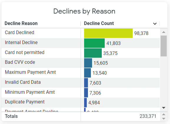
Declines by Reason
The Declines by Reason table displays the most common decline codes and a sum total of all the decline codes during the specified timeframe.
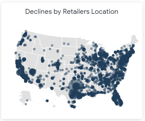
Declines by Retailer Location
The Declines by Retailer Location graph displays the geographic locations where cash transactions have declined within the specified timeframe. To see the total number of declines that occurred within that zip code, hover over the corresponding dot on the map.
Declines as a Percentage of Total Payments
The Declines as a Percentage of Total Payments shows the ratio of declined transactions to total payments for that date. This chart also displays the maximum allowable percentage line for declines. To see the precise decline percentage for a particular date, hover over the corresponding bar in the graph.
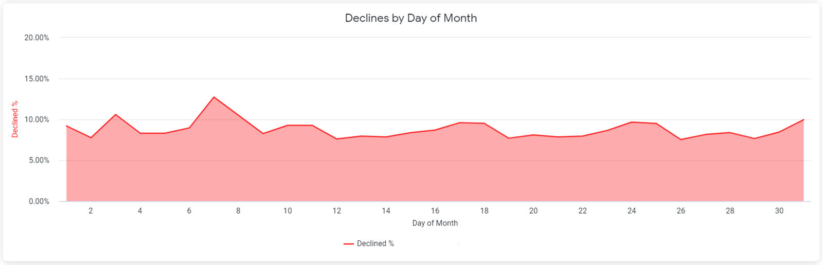
Declines by Day of the Month
The Declines by Day of the Month chart displays the decline percentage for specific days of the month. To see the percentage for a particular day of the month, hover over that point in the graph.
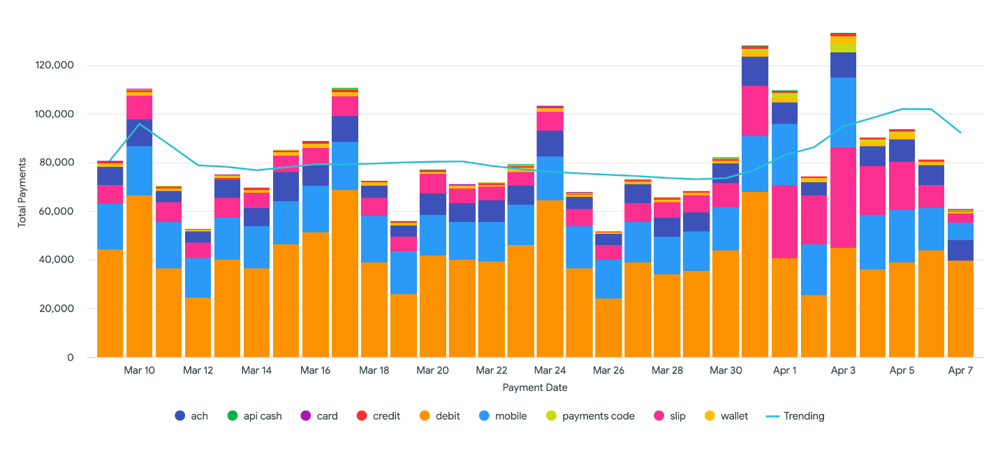
Declines by Payment Type
The Daily Declines by Payment Type chart displays transactions declines for specific payment types for each day of the specified timeframe. For best results, the Payment Date filter should be set at no more than the Last 30 Days.
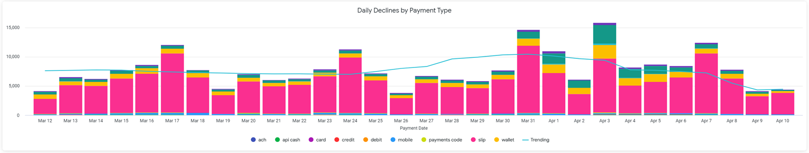
The following payment types are represented:
Payment Types DisplayedYour merchant configuration might only support certain payment types (e.g., cash only).
| Payment Type | Description |
|---|---|
| ach | Bank Account |
| api cash | Cash using an API-generated payment slip |
| card | PayNearMe card (no longer supported) |
| credit | Credit Card |
| debit | Debit Card |
| mobile | Cash using a barcode in the Consumer Portal |
| payment code | Cash using a QR code |
| slip | Cash using a printed payment slip |
| wallet | Mobile Wallet, such as
|
Using the ACH Returns Dashboards
Use the ACH Returns Dashboards to determine when, where, and why ACH payments are being returned.
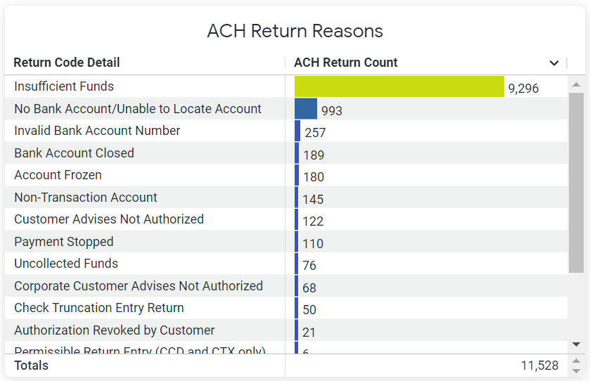
ACH Return Reasons
The ACH Return Reasons table displays the most common return reasons and a sum total of all the returns during the specified timeframe.
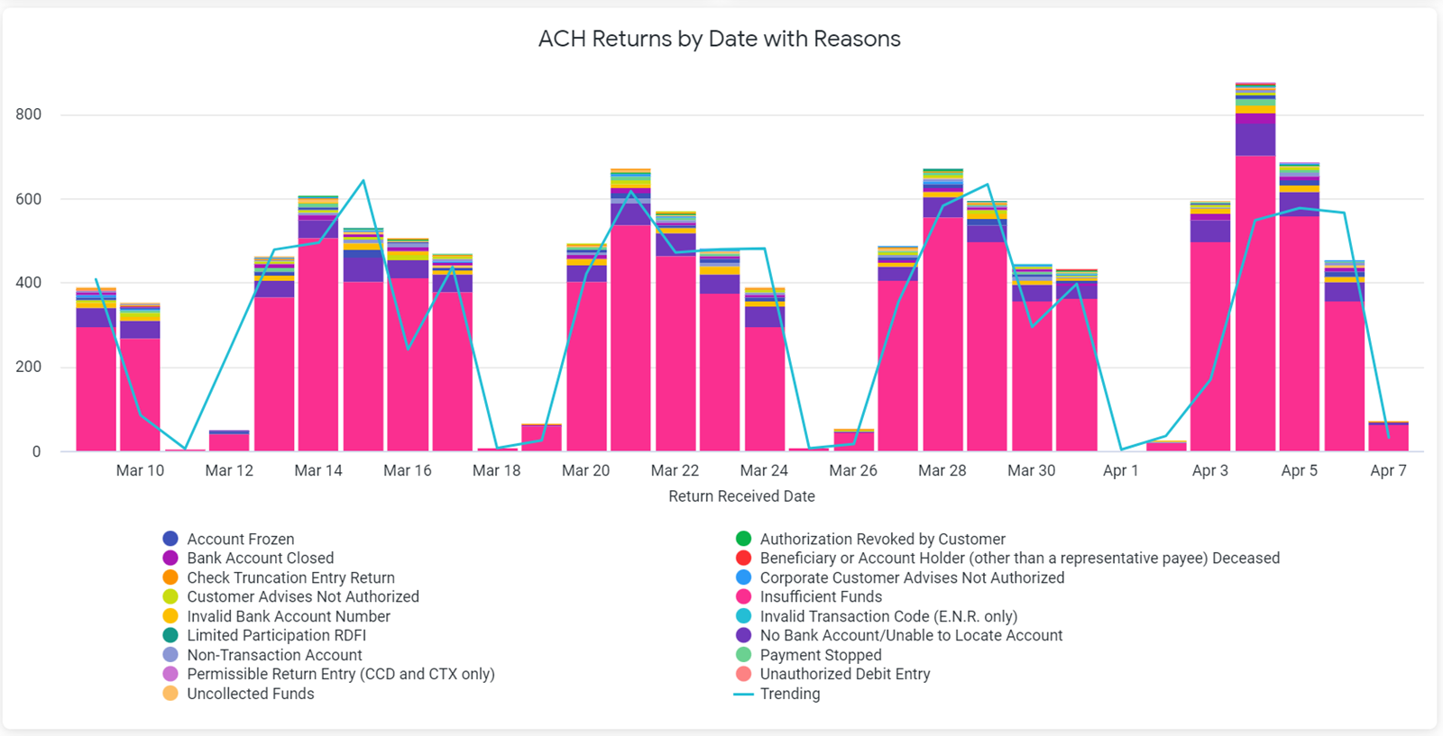
This data is also displayed in the ACH Returns by Date with Reasons chart, which displays the number of returns and the reasons for the returns for a particular date within the specified timeframe. Hover over the corresponding bar to see the reason for the return and how many returns were made that day. For best results, the Payment Date filter should be set at no more than the Last 30 Days.
ACH Returns by Origin
Use the ACH Returns by Origin chart to view how many ACH transactions were returned for each PayNearMe product within the specified timeframe.
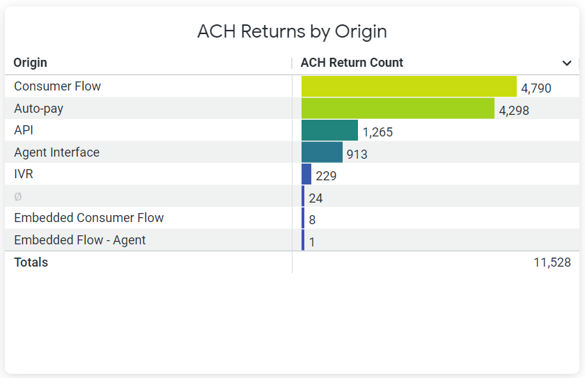
The following PayNearMe products are represented:
Displayed ProductsThe products that display on your dashboards will depend on how you are integrated with the PayNearMe platform.
| Payment Origin | Description |
|---|---|
| API | API Integration |
| Auto-pay | Autopay Schedules |
| Consumer Flow | Consumer Portal |
| Embedded Flow - Agent | Agent via Embedded Form |
| Embedded Consumer Flow | Embedded Client |
| IVR | IVR Integration |
| Agent Interface | Agent Interface (Business Portal) |
| Retailer | Retailer |
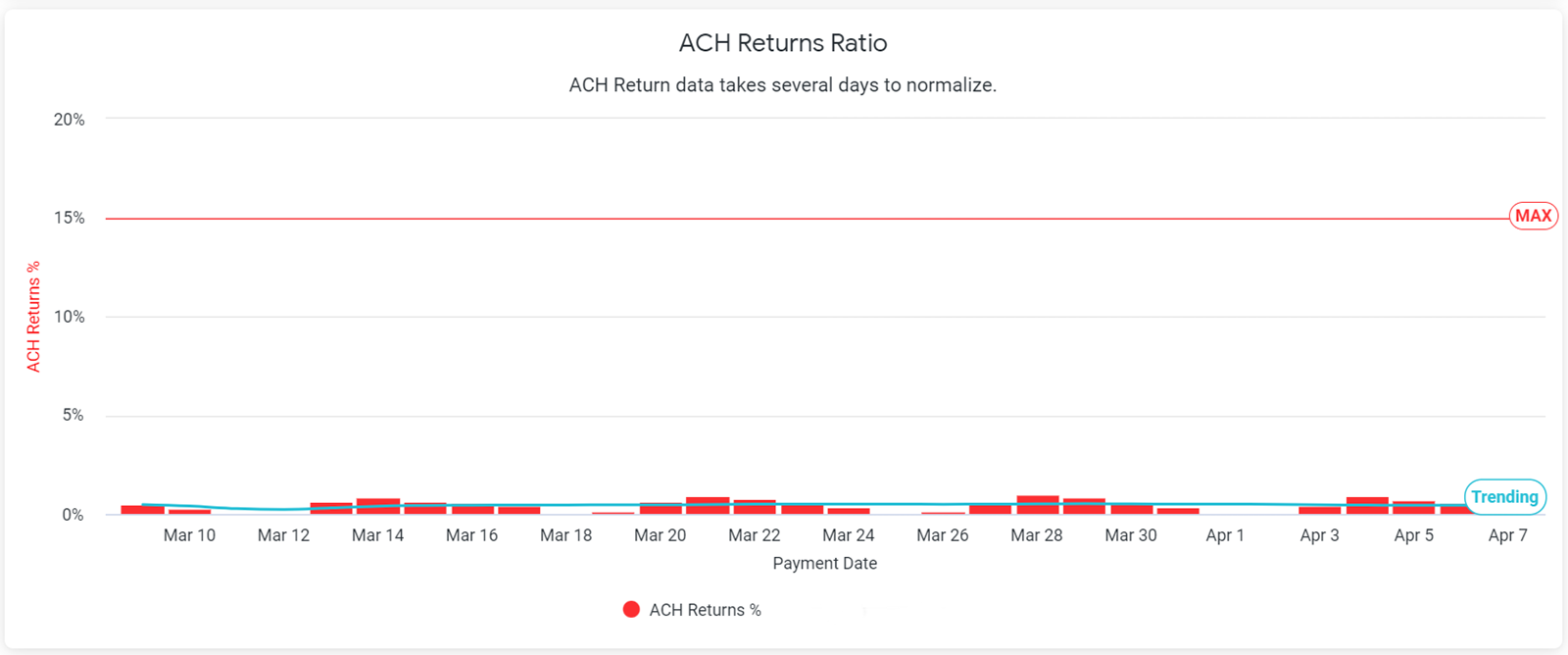
ACH Returns Ratio
The ACH Returns Ratio chart shows the percentage of returned ACH transactions to total payments for that date. This chart also displays the maximum allowable percentage line for returns. To see the precise return percentage for a particular date, hover over the corresponding bar in the graph.
Using the Chargebacks Dashboards
Use the Chargebacks Dashboards to determine when and where card chargebacks are occurring for the specified timeframe.
Chargebacks by Origin
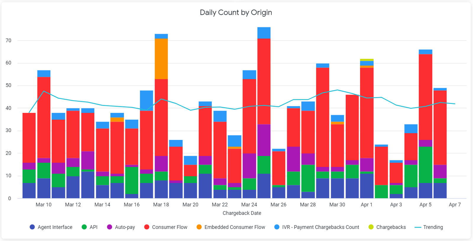
Use the Chargebacks by Origin and Daily Count by Origin charts to view how many card transactions resulted in chargebacks for each PayNearMe product.
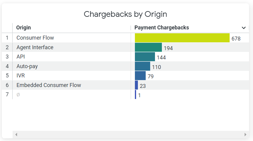
The following PayNearMe products are represented:
Displayed ProductsThe products that display on your dashboards will depend on how you are integrated with the PayNearMe platform.
| Payment Origin | Description |
|---|---|
| API | API Integration |
| Auto-pay | Autopay Schedules |
| Consumer Flow | Consumer Portal |
| Embedded Flow - Agent | Agent via Embedded Form |
| Embedded Consumer Flow | Embedded Client |
| IVR | IVR Integration |
| Agent Interface | Agent Interface (Business Portal) |
| Retailer | Retailer |
This data is also represented in the Daily Count by Origin bar graph. To see the number of charged back transactions via a specific PayNearMe product on a specific date, hover over its corresponding bar in the chart. For best results, the Payment Date filter should be set at no more than the Last 30 Days.
Chargebacks by Type
The Chargebacks by Type chart displays the chargeback percentages for specific payment types.
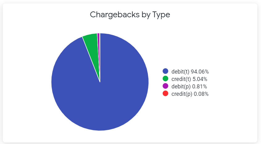
The following payment types are represented:
| Payment Type | Description |
|---|---|
| credit | Credit Card |
| debit | Debit Card |
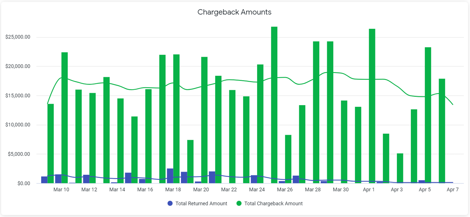
Chargeback Amounts
The Chargeback Amounts chart displays the total amount that was charged back and the total amount that was returned for a specific date. To see the precise chargeback amount or the precise returned amount for a particular date, hover over its corresponding bar in the chart. For best results, the Payment Date filter should be set at no more than the Last 30 Days.
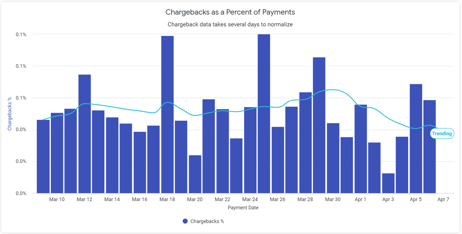
Chargebacks as a Percentage of Payments
The Chargebacks as a Percentage of Payment chart shows the ratio of chargebacks to total payments for that date. To see the precise chargeback percentage for a particular date, hover over the corresponding bar in the graph. For best results, the Payment Date filter should be set at no more than the Last 30 Days.
Using the Autopay Dashboards
Use the Autopay Dashboards to determine how often consumers are scheduling and automating their payments using Autopay.
Autopay Counts
The Daily and Weekly Autopay Counts charts display how often an autopay payment occurs for the specified timeframe.
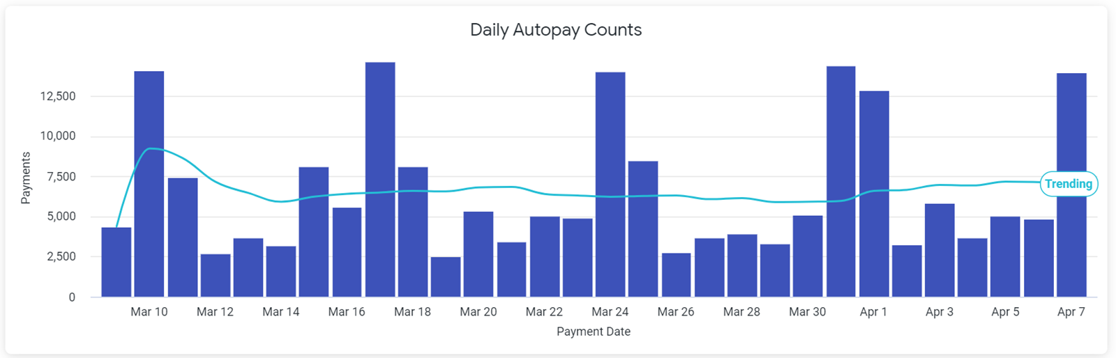
Daily Autopay Counts
The Daily Autopay Counts chart displays the total number of autopay payments that occurred for a specific date. To see the precise number of autopay payments for a particular date, hover over the corresponding bar in the graph. For best results, the Payment Date filter should be set at no more than the Last 30 Days.
Weekly Autopay Counts
The Weekly Autopay Counts chart displays the total number of autopay payments that occurred during a specific week. This chart also displays the payment types used in the autopay schedules. To see the precise number of autopay payments made with a specific payment type, hover over the corresponding bar in the graph.
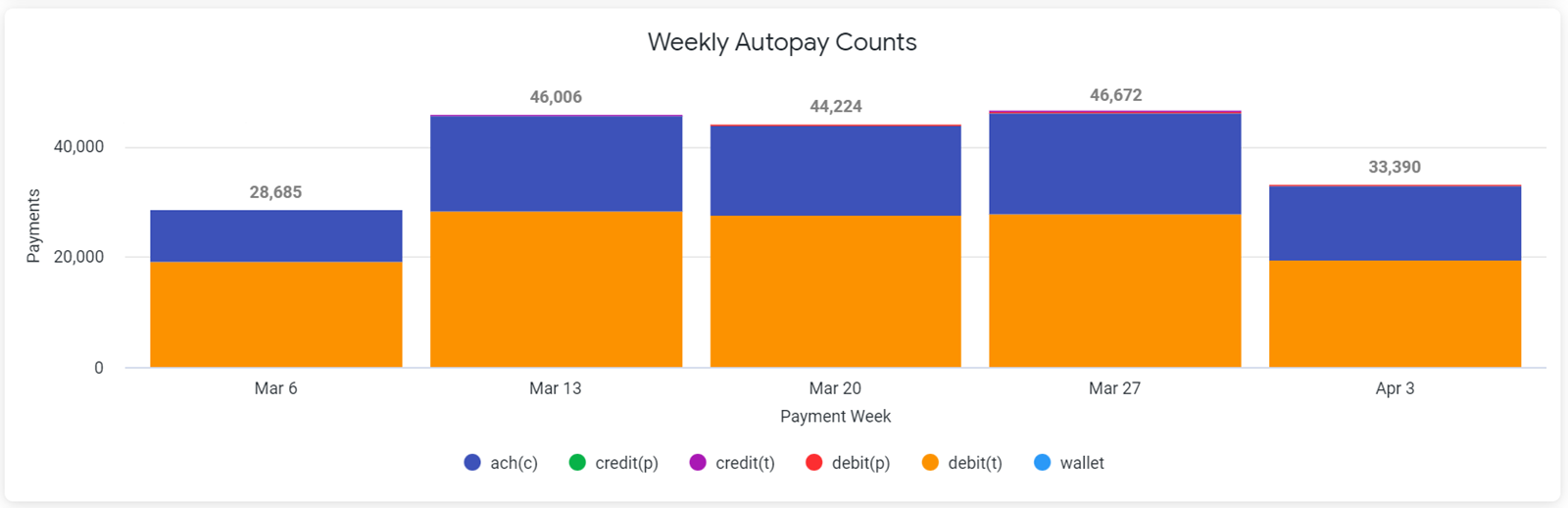
The following payment types are represented:
| Payment Type | Description |
|---|---|
| credit | Credit Card |
| debit | Debit Card |
| ach | Bank Account Transfer |
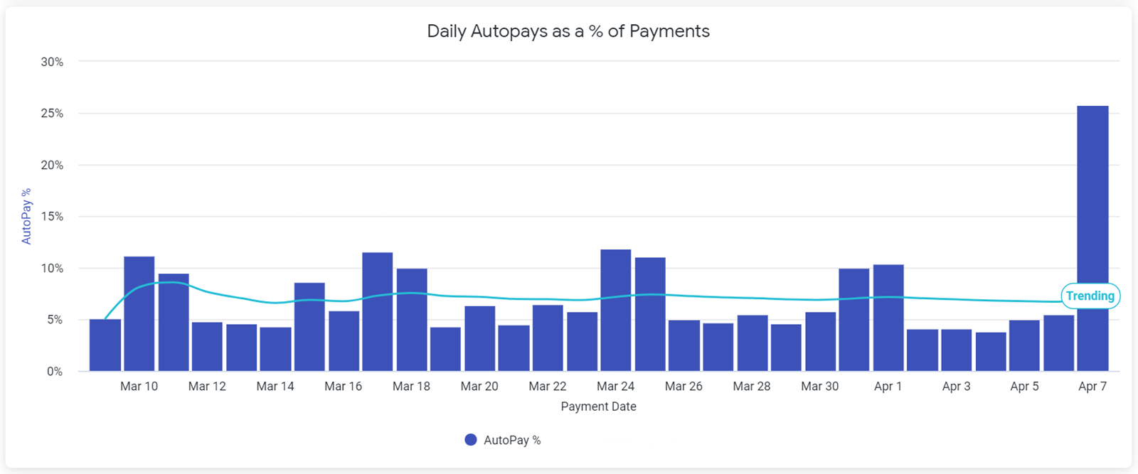
Daily Autopays as a Percentage of Payments
The Daily Autopays as a Percentage of Payment chart shows the ratio of autopay payments to total payments for each day of the month. To see the precise autopay payment percentage for a particular date, hover over the corresponding bar in the graph. For best results, the Payment Date filter should be set at no more than the Last 30 Days.
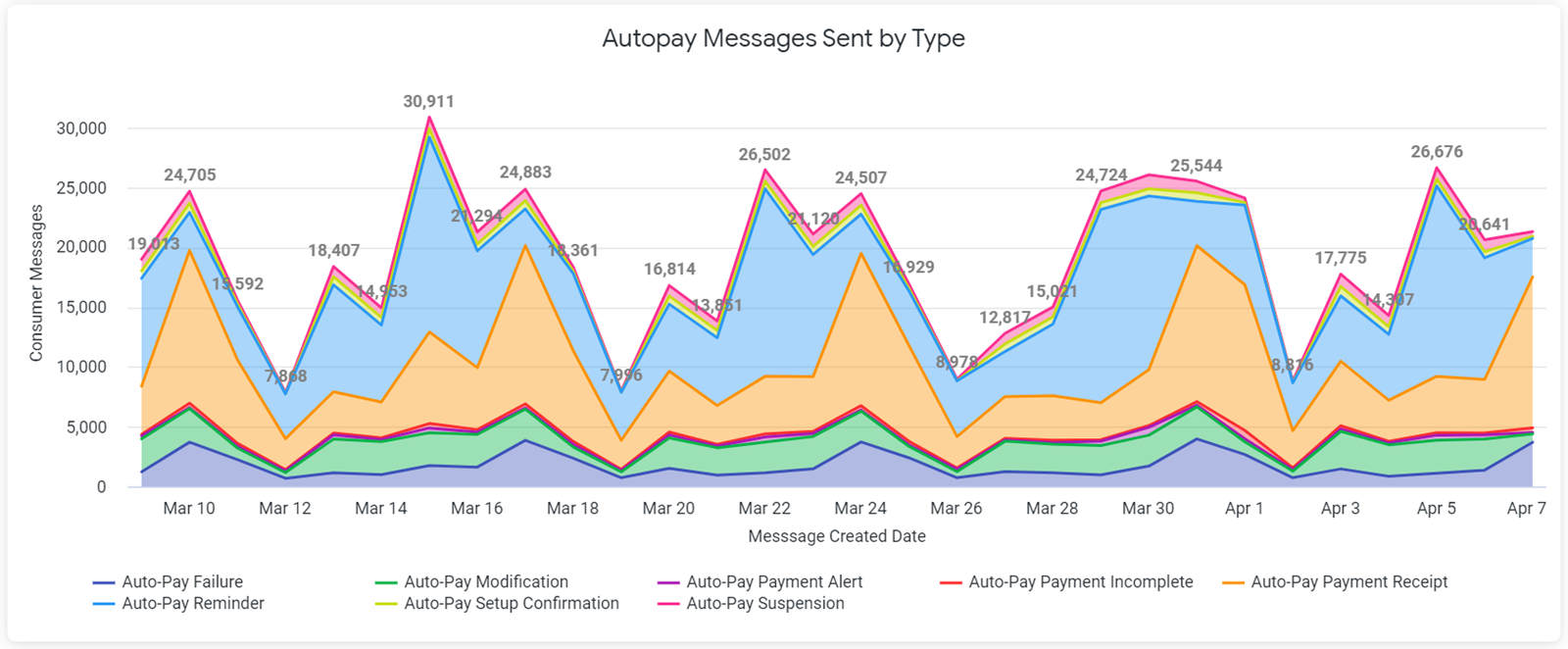
Autopay Messages Sent by Type
The Autopay Messages Sent by Type chart displays the total number of the different types of autopay SMS or email messages that were sent for a particular date. To see the exact number for a particular type of message on a specific date, hover over the corresponding point in the graph. For best results, the Payment Date filter should be set at no more than the Last 30 Days.
Using the Engagements Dashboards
Use the Engagements Dashboards to determine the number and type of engagement messages that are sent within a specified timeframe.
Message Types
The Message Types chart displays the total number of each type of engagement message that was sent during the specified timeframe.
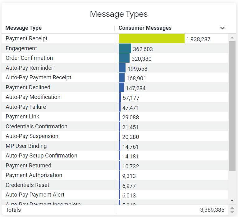
This data is also broken down further into Email and SMS messages in the Email Message Counts by Type and SMS Message Counts by Type charts.
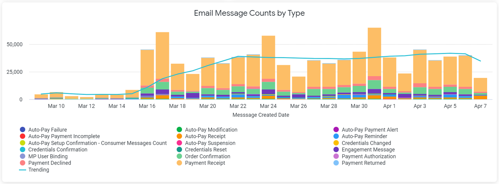
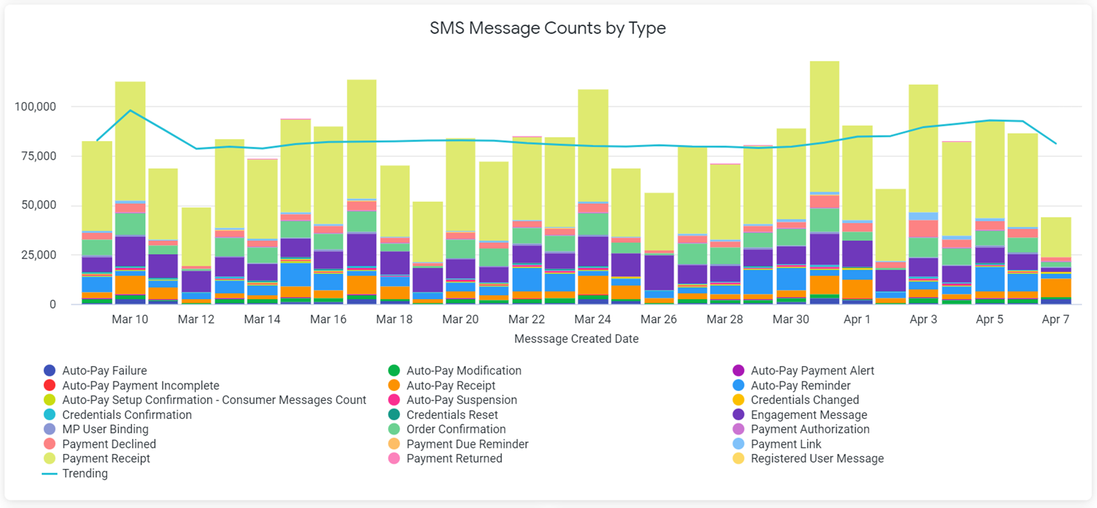
To see the exact number for a particular type of message on a specific date, hover over the corresponding bar in the graph. For best results in both charts, the Payment Date filter should be set at no more than the Last 30 Days.
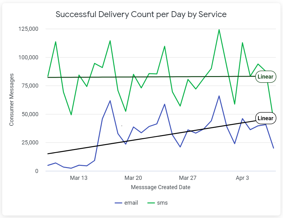
Successful Delivery Count
The Successful Delivery Count Per Day by Service chart displays the total number of SMS and Email engagement messages that were successfully sent each day. To see the precise number of messages sent via email or SMS on a specific date, hover over the corresponding point in the graph. For best results, the Payment Date filter should be set at no more than the Last 30 Days.
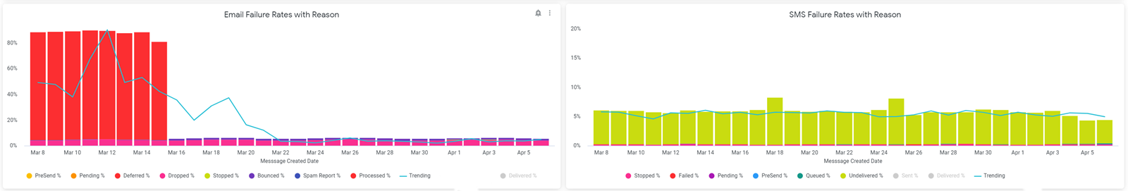
Failure Rates
The Email and SMS Failure Rates with Reasons charts display the ratio of failed email and SMS messages to the total number of email and SMS messages sent that day and provides reasons for the failures. To see the exact percentage of failed messages for a specific reason, hover over the corresponding bar in the graph. For best results in both charts, the Payment Date filter should be set at no more than the Last 30 Days.
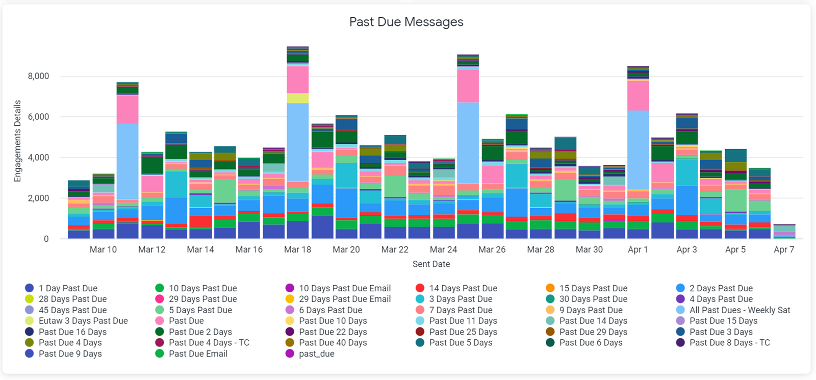
Past Due Messages
The Past Due Messages chart displays the total and type of past due messages sent for a particular day. To see the exact total for a particular type of past due message on a specific date, hover over the corresponding bar in the graph. For the best results in both charts, the Payment Date filter should be set at no more than the Last 30 Days.